UX Testing: Forms and Responses
In this post, I will talk about the UX Testing process I did with my classmates. This UX Testing will be essential as feedback for my overall website. You can find the link to my UX Testing & Feedback form by clicking on this link: UX Testing & Feedback
To begin with, I created the google form, consisting of various questions regarding usability and navigation, overall design, mobile view, opinions on each page in the website, social media, as well as additional feedback that they can suggest. After that, I asked my classmates to fill the form while I do the same by checking their websites and filling their UX Testing form.


Moving on to the navigation and usability of the website. Majority responded with good with the others saying Excellent. As such, I also can conclude that the navigation and usability of the website has gained a positive response.

Next, regarding the Home page, majority have expressed Excellent and Good. As such, I can conclude that the Home page has enough detail on content and design.

Then, for the About Me page, majority responded with Good and another half with Excellent. It can be concluded that reception towards the About Me page is already positive.

For the Gallery page, reception is more mixed with majority saying god, but half saying fair and excellent. As such, I believe that I need to add more to the Gallery page in terms of the content and the design of the page.

Next, majority of response said that the Contact page is good and the other excellent. As such I believe that the content and design can be a little bit more improved, but is otherwise good.

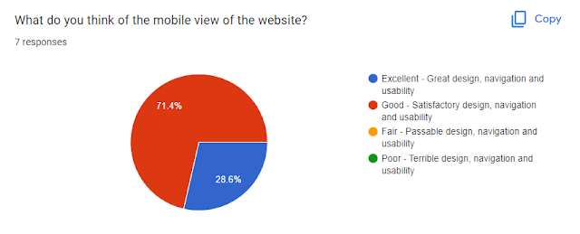
Moving on, about the mobile view, an overwhelming majority responded Good with only 28.6% saying Excellent. As such, I believe that there could be more done to the mobile view of the website.
Then, for the social media links. More than half responded with good and another half responded with excellent. As such I believe that the social media links are working and is good enough.


Having looked at the responses, the next post will be about changing some parts of my website based on these responses.


Good that you posted this.
ReplyDelete