Website Quality Check and Enhancement Features
In this post, I would like to detail the quality check and enhancement process of my website.
To begin with, I went to the Search Engine Optimization (SEO) section where I will be checking the SEO setup checklist. In particular, I did every process in Step 1 except for the custom domain (paid) and google search console which requires the previous steps to be completed. On the second step, I updated each page with a descriptive text, with the only task left unchecked being to add my email on the home page. Checking the SEO should mean that people can find my website more easily, as there are now more keywords being added to the SEO.

Moving on to the website itself, I added new apps. The first app I added is a social media feed app by POWR. It is linked to my film Instagram page. I felt that previously, the home page lacked a representation of films, as the pictures are photography, while the project below is the script. Because of that, I added this social media feed to add more variety to the home page.

Next up, I installed an app named Right Click Protect in which it protects the images or videos used within the website from being downloaded or saved by blocking them from right clicking on the photo or video. This is particularly useful for my own photographs and videos to not be stolen and used by someone else without my permission.


After adding these apps, I did some changes to the home page. Firstly, I changed the last section to be "My Gallery". It originally was a section showing the script I had written on first term as an upcoming project. As such, I changed it to My Gallery, with the picture being my podcast cover art as the old last section is simply outdated. For the comments and social media section, I colored the section black, and changed the social media icons to black with white circle backgrounds so to remove too much white color.

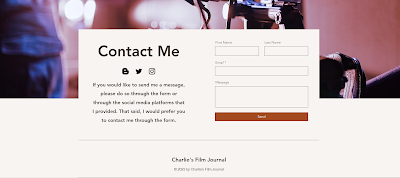
For the contact page, I changed the layout into a different one, making it more simple. The title, social media buttons, and description are in the same section as the form now. I also added an image background from Wix about a filmmaker so that the contact page is not too plain.
Next, I checked the mobile view of the site. Firstly, I fixed the social media feed section. There are difficulties here as the feed can't be resized, and it has an ugly POWR logo below it. Furthermore, because the feed can't be resized, the section would be immensely long vertically if I were to include the four posts. As such, I made it into a horizontal form, enough for one post only, then covering up the other images and the POWR logo with a black box. I also added the social media bar below it as there is free space. Lastly, I only adjusted the wrong positioning on the section below it.


After that, I hide all of the right click protect text on photos and videos. This is because I can't resize them and because it looks ugly in front of the picture/video. As such, hiding it makes it look better while also still functioning to protect the media. Lastly, on the contact me page, I did a minor positioning, making the title bigger, and the description smaller.


With that, I have done quality check and enhancement feature for the website.


Comments
Post a Comment